Project Overview
Exploring the design of a new onsite video platform, SBCTV. A journey of exploring UI and UX strategies that produce an engaging onsite video platform while maintaining the brand identity and accessibility for our target users.
Exploring the design of a new onsite video platform, SBCTV. A journey of exploring UI and UX strategies that produce an engaging onsite video platform while maintaining the brand identity and accessibility for our target users.

To ensure Scrapbook.com's internal video platform could compete with third-party services like YouTube and Vimeo, we conducted an in-depth analysis of these platforms. The goal was to identify their strengths and weaknesses and incorporate the best features into our platform while maintaining the brand identity and accessibility for our target users.
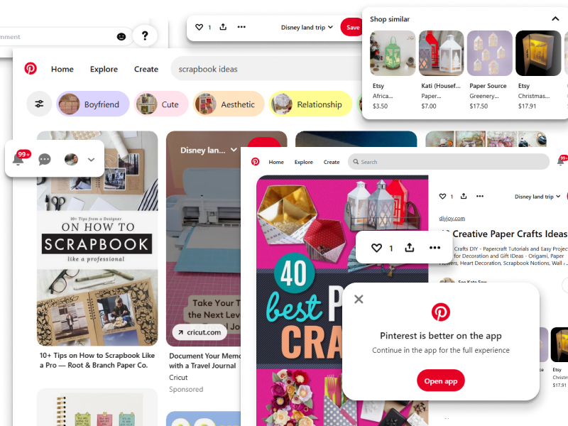
This image features a typical Pinterest interface displaying a user's crafting pinboard. The key features and interactions within the platform are outlined below.
Visual Discovery: Pinterest excels in visually driven content discovery, allowing crafters to find and save projects easily.
Content Organization: Users can save, share, and organize their favorite crafting projects into pinboards, enhancing user engagement.
Not Video-Centric: Pinterest primarily focuses on images and is not optimized for video content, limiting the potential for in-depth tutorials and educational content.
No Shopping Integration: While users can save ideas, they cannot make purchases directly through the platform.

This image showcases a typical YouTube interface with a Scrapbook.com livestream in progress. The key features and interactions within the platform are outlined below.
Live Chat: The live chat on the right-hand side allows for real-time interaction between the host and viewers, a strength in building community engagement.
Distractions: The right-hand column shows distracting video recommendations, which could easily pull users away from Scrapbook.com's content. This highlights a major weakness—YouTube's algorithms can divert attention from brand-specific content, leading to missed opportunities for direct engagement and conversions.
The absence of shopping integration is another missed opportunity, as users must navigate away from the video to make purchases.
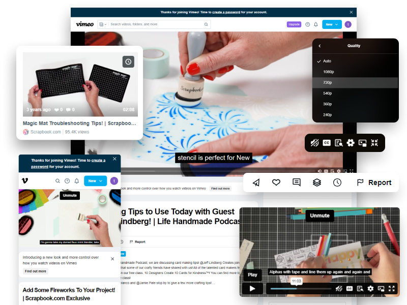
This image illustrates the standard Vimeo interface with Scrapbook.com content playing. The key features and interactions within the platform are outlined below.
Clean and professional design: The lack of distracting ads or recommended videos allows for a seamless, high-quality viewing experience.
Customizable controls: Quality settings (1080p, 720p), closed captioning, and fullscreen mode show Vimeo's focus on delivering a distraction-free, professional viewing environment.
Visual hierarchy: A pop-up prompting the user to create an account could deter casual viewers.
Lacks real-time engagement tools: The platform lacks comments or live chat, limiting community interaction during video playback.

This image illustrates the standard Vimeo interface with Scrapbook.com content playing. The key features and interactions within the platform are outlined below.
Real-Time Interaction: Twitch's live chat feature allows for real-time viewer engagement during streams, making it ideal for building active communities.
Monetization Opportunities: Twitch offers creators revenue streams through subscriptions, donations, and Twitch Prime.
Cluttered Interface: Twitch's interface can be overwhelming, especially for older audiences unfamiliar with live streaming, leading to potential usability issues.
Gaming-Centric: The platform is heavily dominated by gaming content, so educational crafting streams might struggle to gain engagement.
In the initial stages of developing InfoX, we conducted extensive ideation and brainstorming sessions to identify user needs, explore possible features, and address usability challenges. This process involved collaborative workshops, sticky note mapping, and early wireframe sketches to visualize core functionalities and user workflows.
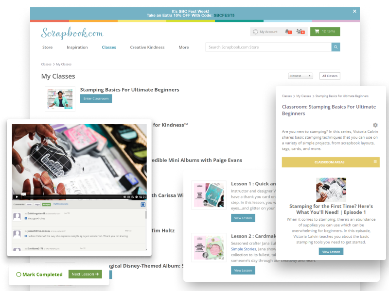
User Workaround: Users are attempting to use the "Class Favorites" feature as a makeshift playlist, which it wasn't designed for. This creates a disjointed user experience.
Fragmented Journey: After selecting a class from their favorites, users must enter the class itself, making it cumbersome to quickly navigate between classes or videos. This disrupts the flow.
Outdated Controls:Once inside the class, the video controls and interface are outdated, lacking basic modern functionalities such as easy forward/reverse buttons or quick class-switching. This results in frustration and a non-intuitive experience.
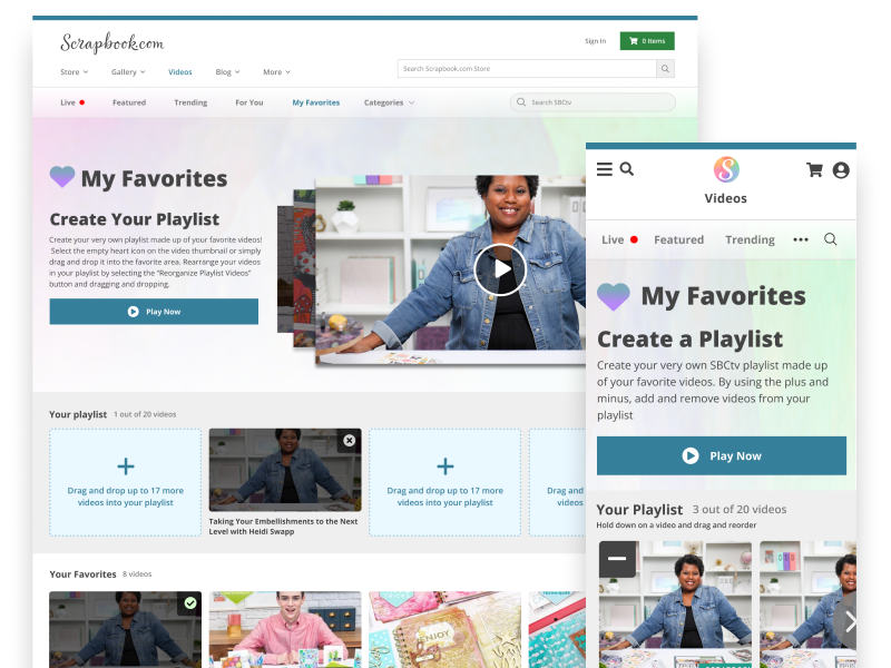
True Playlist Functionality: The new design focuses on a dedicated playlist feature, allowing users to seamlessly navigate between videos or classes without the need to enter each one individually.
Streamlined Navigation:Users can quickly view their entire playlist with one click and move between content without the friction of re-entering individual class pages.
Modern Controls: Updated video controls ensure a smoother experience with modern functionalities like skip, playback speed, and progress tracking.
High-fidelity prototypes were created in Figma to simulate the user experience and were tested with real users for feedback.
The mobile prototype ensured responsiveness and seamless drag-and-drop functionality, optimized for smaller screens.
The desktop version incorporated advanced features like customizable playlists and content suggestions, driving higher user engagement.
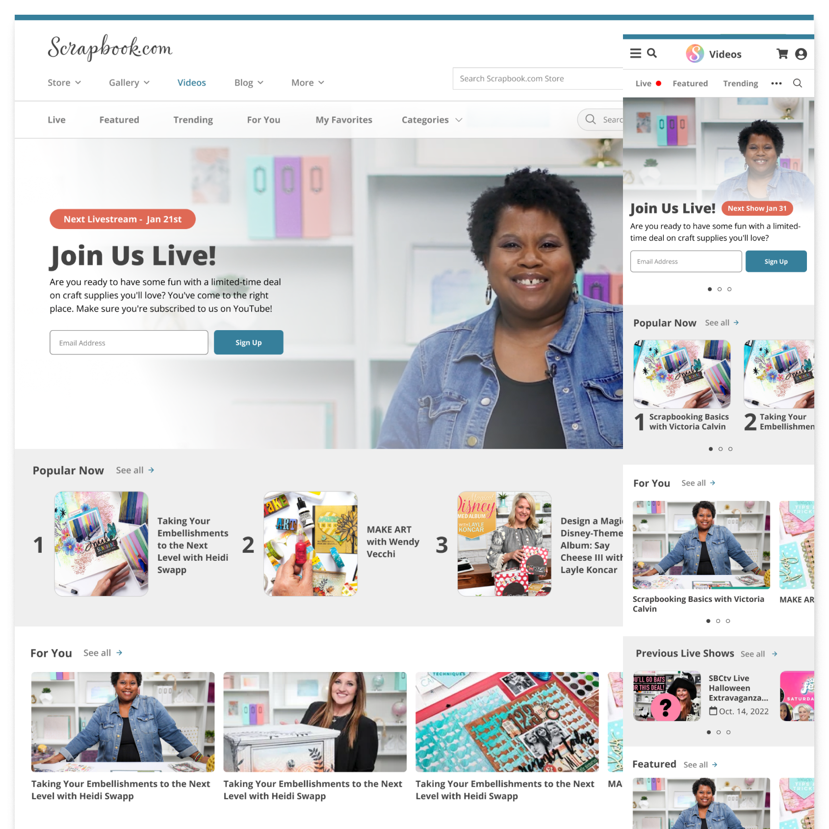
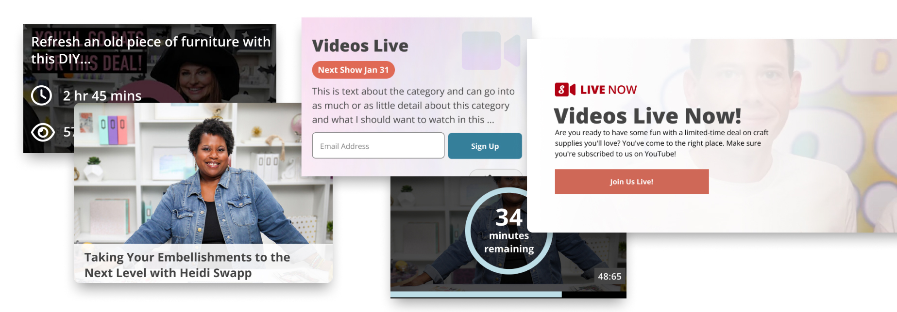
This page motivates users to register for upcoming live crafting sessions with personalized recommendations based on past behavior. Engaging imagery and clear CTAs streamline sign-ups, ensuring users can effortlessly access content. The use of interactive elements enhances the user experience by providing easy navigation across various live streams.
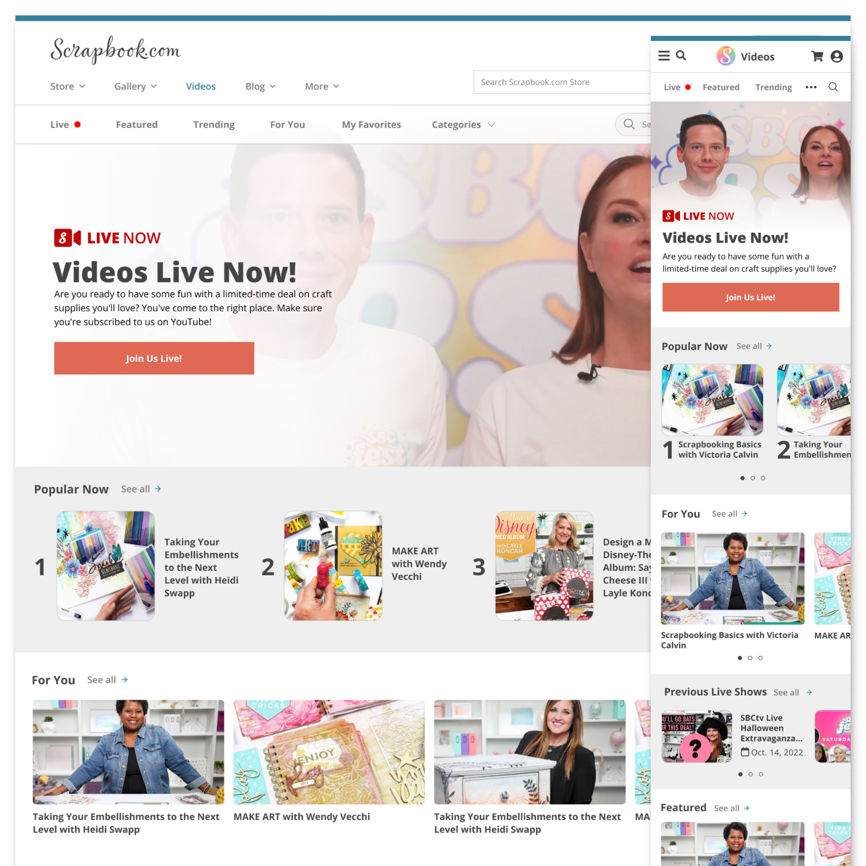
The live streaming page offers real-time crafting tutorials with intuitive access to ongoing sessions. Dynamic video integration keeps users updated, and optimized layouts ensure a seamless viewing experience across devices. Enhanced with prominent CTAs, users can join tutorials instantly with minimal clicks.
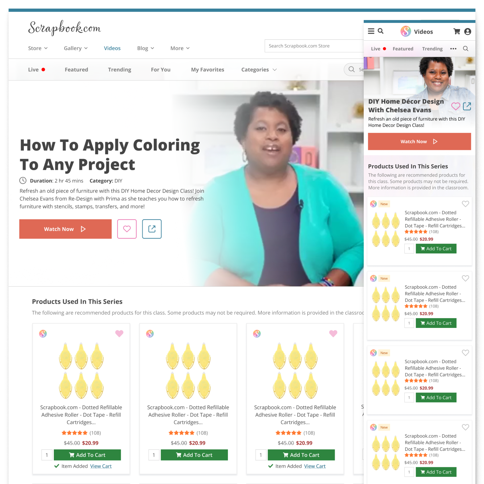
This how-to page features a structured tutorial interface that helps users apply new techniques. Each tutorial is broken into digestible steps with video segments and clear visual instructions. Personalized recommendations based on user preferences keep the content relevant and engaging.
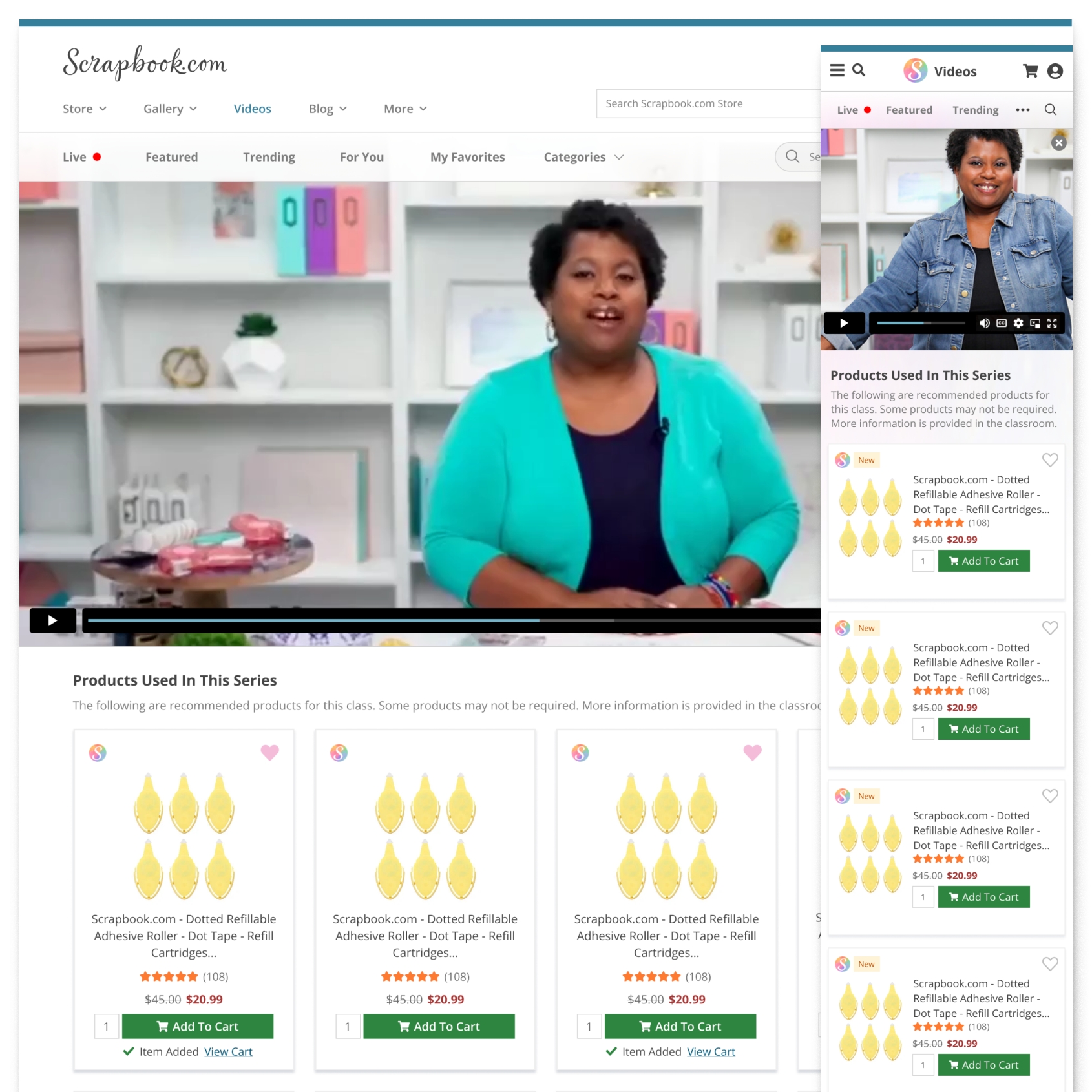
This mobile-optimized video store allows users to browse, save, and view trending crafting tutorials on demand. The design emphasizes easy navigation and quick access, ensuring tutorials can be viewed on smaller devices. Users are kept up-to-date with the latest video releases, creating a dynamic learning experience.
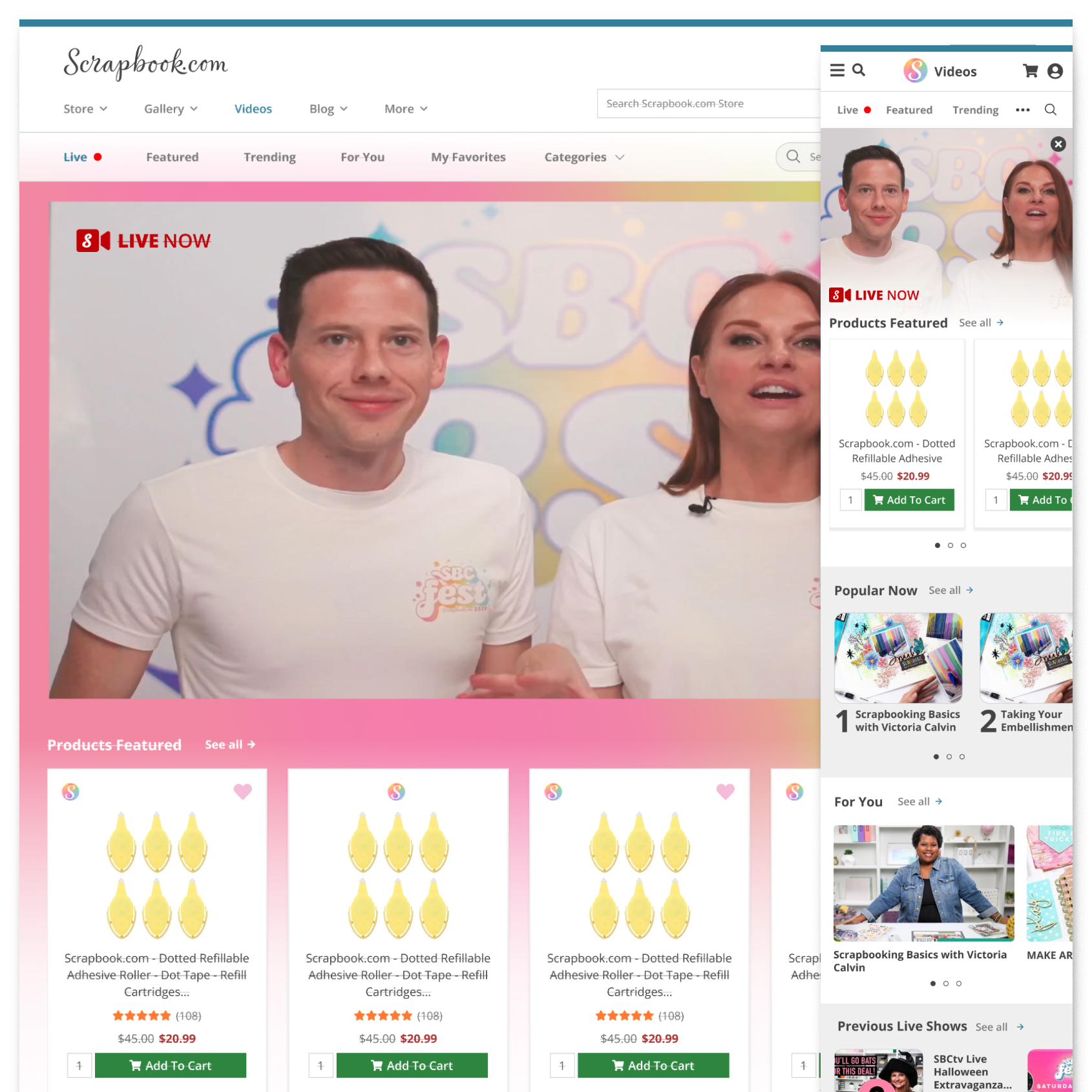
A clean, image-rich layout introduces users to live craft events, offering details such as live streaming schedules and product information. The inclusion of product showcases enhances engagement and encourages users to make real-time purchases. The page also promotes immediate participation with prominent “Join Now” buttons.

This page functions as a central hub for SBC's Craft Fest, offering real-time event streaming, interactive chat options, and product showcases. The event integration encourages active participation, while mobile optimization ensures users can access the content anywhere.
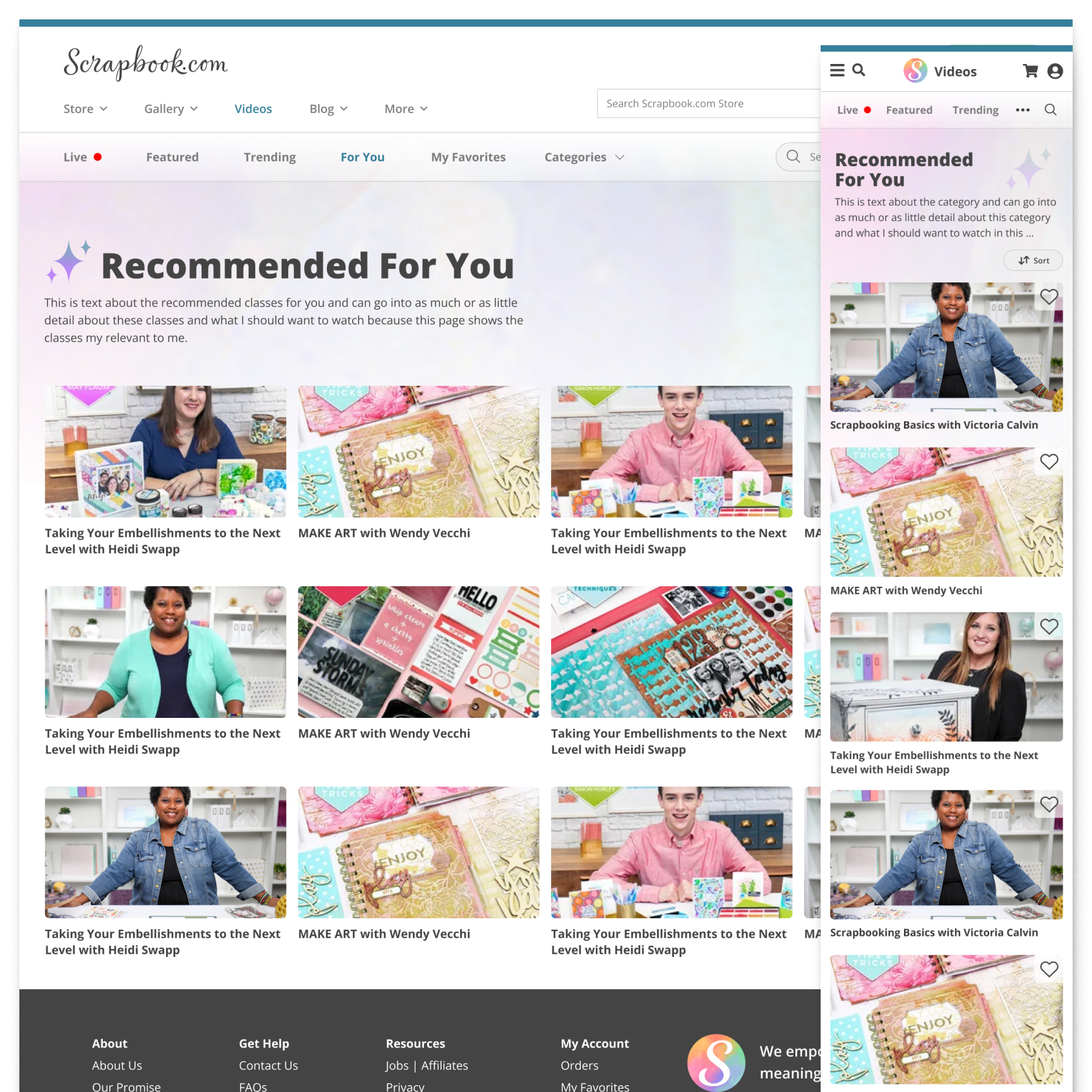
This recommendation section offers users a curated list of crafting tutorials, personalized to their interests. Featuring top-rated tutorials and trending releases, the design emphasizes easy discovery of new content, providing users with fresh learning opportunities.

Users can quickly access a saved list of their favorite classes, ensuring they never lose track of valuable content. The layout optimizes both desktop and mobile views for smooth navigation, creating a seamless experience across devices.